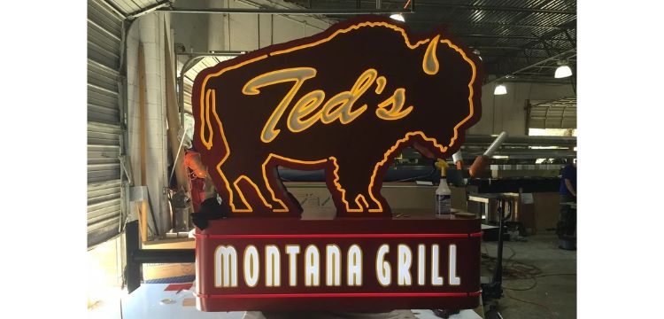
A business sign needs to communicate important information quickly, especially when customers are approaching by car. Drivers usually have only a few seconds to notice a sign, recognize the business name, and understand where to turn. If the lettering is too small, the colors blend together, or the design contains too much information, potential customers may miss it entirely. A clear and well-planned sign makes your business easier to find.
Creating effective Sign Design & Manufacturing Atlanta businesses can benefit from starts with understanding how people view signage from a moving vehicle. The design should prioritize readability, visibility, and simple messaging. Every element, from font selection to sign placement, should help drivers recognize your business without distraction.
1. Choose Large and Readable Fonts
Font selection has a major impact on how easily drivers can read your sign. Decorative or complicated fonts may look attractive up close but can become difficult to understand from a distance.
Choose clean, simple fonts with clear letter shapes. Make sure the business name is large enough to be visible from the road. Avoid using too many different font styles because they can make the design look crowded.
Before finalizing the design, review how the lettering appears from different distances. The goal is to make the main message easy to recognize at a glance.
2. Use Strong Color Contrast
Color contrast helps the lettering stand out against the sign's background. If the text and background have similar shades, the message may become difficult to read, particularly in bright sunlight or low-light conditions.
Consider these practical design tips:
Use light-colored lettering on a dark background or dark lettering on a light background.
Choose brand colors that provide sufficient contrast.
Avoid combining too many bright colors.
Keep the background simple so the main message remains noticeable.
A balanced color combination improves visibility while keeping the sign consistent with your business branding.
3. Keep the Message Short and Simple
Drivers do not have time to read long descriptions or multiple promotional messages. Your sign should communicate only the most important information.
For most businesses, this includes the business name, logo, and a short description of the service or product when necessary. If you want to include a phone number or website, make sure it does not compete with the main message.
Avoid unnecessary graphics, long slogans, and excessive details. A simple layout allows customers to understand the purpose of your sign more quickly.
4. Consider Letter Size and Viewing Distance
The size of the lettering should match the distance from which people are expected to see the sign. A sign placed near a busy road may require larger letters than one installed close to a pedestrian entrance.
Think about the speed of passing traffic, the road layout, and the distance between the sign and approaching drivers. Also consider whether the sign will be viewed from multiple directions.
Planning these details during the design stage helps prevent readability problems after installation.
5. Select the Right Sign Type and Lighting
Different sign styles offer different visibility benefits. Channel letter signs, monument signs, pylon signs, and illuminated displays can help businesses attract attention depending on their location and requirements.
Lighting is particularly important for businesses that operate in the evening. Illuminated signs can make lettering easier to notice after sunset, while properly positioned exterior lighting can improve visibility for non-illuminated displays.
The selected sign type should complement the building, surrounding environment, and intended viewing distance.
6. Test the Design Before Manufacturing
Before approving a final design, review a mockup and evaluate how it will look in its actual installation environment. Check the font size, color contrast, spacing, and overall message.
Consider viewing the design from different angles and distances. This can help identify issues that may not be obvious when looking at the artwork on a computer screen. An experienced signage team can also recommend adjustments to improve visibility and installation suitability.
Altair Sign & Light can support businesses through the sign design and manufacturing process, helping bring branding requirements and practical signage considerations together.
Conclusion
A road-facing business sign should be simple, visible, and easy to understand within seconds. Choosing readable fonts, strong color contrast, concise messaging, suitable lettering sizes, and appropriate lighting can improve its effectiveness. Careful design planning before manufacturing and installation helps businesses create signage that attracts attention and makes their location easier for customers to recognize.